1.8. Seasonal Analisis of discharges in the Mälaren catchement.
Jacopo Cantoni
Discharge data are a valuable resource and a key dataset. Discharge data across sweden are freely available from the Swedish Metereological and Hidrological Institute (SMHI). Such data are obteained from a series of actual measuring stations that are futher expanded with the use of the HYPE model that give a full coverage of the entire territory.
The objectictive of this work is to create an automatic rutine to retrieve, in an eficent way, discharge data and transform them in an manageable data structure for futher analisis. The final step is to use the obtained dataset to identify boundaries of seasonal patterns.
The structure of the SMHI dataset is based on a fine catchement division and the whole territory is devided in more than 55000 areas. For the closing point of each of these catchements is available a time series of Modelled discharges (m³/s) with the time resolution of the day starting from year 1981.
Such data can be directly obtained, selecting a specific area (https://vattenwebb.smhi.se/modelarea/) or listing catchement IDs (https://vattenwebb.smhi.se/nadia/). The firs method method is suitable to obtain information for only a small number of catchements while the second is better suited for our scope.
The first step is then to obtain the IDs of the catchement that we are interested. Relevant shapefiles can be obtined also from SMHI: (https://www.smhi.se/data/hydrologi/sjoar-och-vattendrag/ladda-ner-data-fran-svenskt-vattenarkiv-1.20127)
Specifically the files:
Huvudavrinningsområden_SVAR_2016_3
Delavrinningsområden SVAR_2016_3
1.8.1. Find ID’s for all the Mälaren’s Catchement sub-catchements.
from the Huvudavrinningsområden_SVAR_2016_3 file is possible to identify the Mälaren catchement shape. Knowing that the Mälaren catchement have the HARO field = to 61000 is possible to select the correct subcatchements from Delavrinningsområden SVAR_2016_3
[1]:
# Cell 1
%cd /home/user/SeasonAnalisis

#inpunt time period
SYear = 2000
EYear = 2020


#from osgeo import ogr
import geopandas as gpd

catchements = gpd.read_file("aro_y_2016_3.shp")
#print (catchements)
#catchements.plot()
#MalarenCatchement = catchements[(catchements.HARO == 61000) & (catchements.YTKOD != 80)]
MalarenCatchement = catchements[(catchements.HARO == 61000) ]
#MalarenCatchement = catchements[MalarenCatchement.YTKOD != 80]
# MalarenCatchemnt is the base map for our region.
#MalarenCatchement.plot()

# the array CatchID conatains all the AROID that of the area in which
# we are interested

CatchID=MalarenCatchement.AROID
print(type(CatchID))


L=len(CatchID)
print(L)
/home/user/SeasonAnalisis
<class 'pandas.core.series.Series'>
2419
[ ]:
Catchements IDs can be used to get discharge data from the SMHI website. The website is not capable of downloading big data for a big number of stations. considering this and for script semplification each station is downloaded singularly and information are stored in a pandas.dataframe
[2]:
# Cell 2
import pandas as pd
#creating the dataframe (df) that will host all data

TIME = pd.date_range(start=str(SYear)+'-01-01',end=str(EYear)+'-12-31')
Ltime = len(TIME)
df1=pd.DataFrame(index=TIME, columns=CatchID)#total Q
df2=pd.DataFrame(index=TIME, columns=CatchID)#area specific Q
Run the following cell if interested in downloading tha data ex-novo alternativelly run the next one to read previously downloaded data stored in a CSV fie. This part is quite time consuming and if the data have been yet downoladed use the next box code to upload them.
[ ]:
# Cell 3
import requests as re

for i in CatchID:

    s = re.session()

#payload are the input to give to the SMHI website for the retriving data
    payload = {
        'idlist' : i,
        'aggregation' : 'day',
        'startYear' : str(SYear),
        'endYear' : str(EYear),
    }

# get data from the website
    response = s.post('https://vattenwebb.smhi.se/nadia/rest/all',
                      data=payload)
    #print (response.status_code)
    data = (response.content)
    data = data.decode("utf-8")
    data = data.splitlines()
    Head1 = data[0]
    Head2 = data[1]
#extracting and storing relevant information
    for j in data:
        if j==Head1 or j==Head2:
            continue
        DATA=j.split(';')
        Date = pd.to_datetime(DATA[2],format='%Y-%m-%d')

        Qtot=DATA[5]
        Qtot=Qtot.replace(',','.')
        df1.at[Date,i] = Qtot

        QArea=DATA[3]
        QArea=QArea.replace(',','.')
        df2.at[Date,i]=QArea
        #print(Date)
        #print(df.at[i,Date])

#print(df2.head())
df1.to_csv('Q_'+str(SYear)+'-'+str(EYear)+'.csv')
df2.to_csv('Qarea_'+str(SYear)+'-'+str(EYear)+'.csv')
[3]:
#Cell 4
df1 = pd.read_csv('Q_'+str(SYear)+'-'+str(EYear)+'.csv')
df2 = pd.read_csv('Qarea_'+str(SYear)+'-'+str(EYear)+'.csv')

df1 = df1.iloc[:,1:]
df1 = pd.DataFrame(df1.values, columns = CatchID, index =TIME)

df2 = df2.iloc[:,1:]
df2 = pd.DataFrame(df2.values, columns = CatchID, index =TIME)
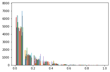
Due to difference in size of different subcatchements, the magnitude of discharges can vary greatly. To solve this issue the dataframe is pretreated using a normalization method. is also shown the disctribution of the data that is strongly skewed on the left.
[6]:
# Cell 5
import numpy as np
from sklearn.preprocessing import MinMaxScaler
import matplotlib.pyplot as plt

for i in CatchID:
    df1[i]=pd.to_numeric(df1[i],downcast='float')
    df2[i]=pd.to_numeric(df2[i],downcast='float')

M1 = df1.values.max()
m1 = df1.values.min()
#n=100
#dBin=(M1-m1)/n
#bins1={'bins':np.arange(m1,(M1+(0.1*dBin)),dBin)}

M2 = df2.values.max()
m2 = df2.values.min()
#n=100
#dBin=(M1-m1)/n
#bins1={'bins':np.arange(m1,(M1+(0.1*dBin)),dBin)}
#print('----------------------------------')
#print('Max value of Q generated by a spefic area:'+str(M2))
#print('Min value of Q generated by a spefic area:'+str(m2))
#plt.hist(df2.values)
#plt.show()
print('----------------------------------')
print('Max value of observed Q:'+str(M1))
print('Min value of observed Q:'+str(m1))
#plt.hist(df1.values)
#plt.show()
print('----------------------------------')
print ('after normalization')


sc = MinMaxScaler(feature_range = (0,1))
dataset = sc.fit_transform(df1.values)


df1Prova=pd.DataFrame(index=TIME)
Tdf1=df1.transpose()
for i in CatchID:
    sc = MinMaxScaler(feature_range = (0,1))
    df1Prova[i] = sc.fit_transform(Tdf1.loc[i].values.reshape(-1, 1))

df1 = pd.DataFrame(dataset, columns = CatchID, index =TIME)


M1 = df1.values.max()
m1 = df1.values.min()
print('Max value of observed Q:'+str(M1))
print('Min value of observed Q:'+str(m1))

plt.hist(df1Prova.values)
plt.show
#print (df1.head)

dataset = sc.fit_transform(df2.values)
df2 = pd.DataFrame(dataset, columns = CatchID, index =TIME)
plt.hist(df2.values)
plt.show

df1.to_csv('NormQ_'+str(SYear)+'-'+str(EYear)+'.csv')
df2.to_csv('NormQarea_'+str(SYear)+'-'+str(EYear)+'.csv')

df1Prova.to_csv('ProvaNormQ_'+str(SYear)+'-'+str(EYear)+'.csv')
----------------------------------
Max value of observed Q:1.0
Min value of observed Q:0.0
----------------------------------
after normalization
Max value of observed Q:1.0
Min value of observed Q:0.0
The following code cell create a color coded map of the discharge in the selected area for each day of the interested period. This are then colected and save in a gif format for visualization.
[ ]:
# Cell 6
import matplotlib.pyplot as plt
import mapclassify
import glob
from moviepy.editor import *
from PIL import Image


Timedf1=df1.transpose()
Timedf2=df2.transpose()

for i in TIME:
    #create a tif file for each day color map on Q'
    dayCatch = MalarenCatchement.set_index('AROID')
    dayCatch = dayCatch.merge(Timedf1[i], on='AROID')

    plt.figure()
    dayCatch.plot(column=i,
                  cmap='viridis',
                  scheme='natural_breaks'
                 )
    plt.savefig(str(i)+'.png')
    plt.show()
    plt.close()
    prova=dayCatch[i]

    prova=prova.isnull()
    b=np.where(prova[0])
    if np.size==0:
        print (i)


imgs = glob.glob('*.png')
clip= ImageSequenceClip(imgs, fps = 3)
clip.write_gif('MoviolatotNoLake.gif')
clip.close
The following cell import the data about the first clusterization perform to reduce the subcatchement dimension.
[16]:
#Cell 7
GeoClass = pd.read_csv('GeoClass.csv')
GeoClass = GeoClass.iloc[:,1:]
GeoClass = pd.DataFrame(GeoClass.values,
                        columns = ['GeoClass'],
                        index = CatchID,
                       )
print(type(GeoClass))
print(GeoClass)
<class 'pandas.core.frame.DataFrame'>
               GeoClass
AROID
652430-143251         1
653065-143452         1
653173-143752         1
653474-143283         1
653976-143263         1
...                 ...
658533-552637         9
658609-557258         9
662890-552741         5
662932-551197         5
664180-542606         4

[2419 rows x 1 columns]
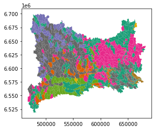
The cluster are showed on the map of the Mälaren catchement
[17]:
# Cell 8
import matplotlib.pyplot as plt
import mapclassify

ClusterCatch = MalarenCatchement.set_index('AROID')
ClusterCatch = ClusterCatch.merge(GeoClass, on='AROID')

print (list(ClusterCatch.columns))
plt.figure()
ClusterCatch.plot(column='GeoClass',
              cmap='Dark2',
             )
plt.savefig('Clusters15.png')
plt.show()
['ET_ID', 'YTKOD', 'NAMN', 'VDRID', 'INOBJ', 'UTOBJ', 'OMRID_NED', 'OMRTYP', 'HARO', 'DISTRICT', 'LANDSKOD', 'AREAL', 'AVM', 'HAVAVM', 'HORDNING', 'AAUEB', 'AA_ANT_ARO', 'MEDHOJD', 'VERSION', 'geometry', 'GeoClass']
<Figure size 432x288 with 0 Axes>
Cell 9 uses the obtained cluster to resize the original dataframe, discharge from homogeneous areas are collapsed in a single value (average).
[18]:
#Cell 9

Tdf1=df1.transpose()
print(Tdf1.index.name)
#print (df1.head)
df1GeoClass = Tdf1.merge(GeoClass, on='AROID')
df1GeoClass = df1GeoClass.groupby('GeoClass').mean()
df1GeoClass.to_csv('df1GeoClass.csv')
print(df1GeoClass.head)
AROID
<bound method NDFrame.head of           2000-01-01  2000-01-02  2000-01-03  2000-01-04  2000-01-05  \
GeoClass
1           0.289802    0.290587    0.297117    0.302977    0.309661
2           0.104935    0.103917    0.104844    0.107146    0.116531
3           0.188470    0.196418    0.203662    0.240717    0.268206
4           0.062980    0.060610    0.062335    0.059395    0.065730
5           0.103323    0.098710    0.104661    0.116903    0.142725
6           0.104400    0.106156    0.238806    0.186725    0.167980
7           0.779957    0.776497    0.772959    0.771627    0.769829
8           0.083394    0.085077    0.082251    0.166874    0.093452
9           0.210893    0.207328    0.211135    0.218442    0.221667
10          0.272583    0.267118    0.264807    0.300864    0.322964

          2000-01-06  2000-01-07  2000-01-08  2000-01-09  2000-01-10  ...  \
GeoClass                                                              ...
1           0.315120    0.325586    0.344750    0.360273    0.365982  ...
2           0.120837    0.138544    0.175712    0.220876    0.236622  ...
3           0.294777    0.352815    0.465375    0.510422    0.483107  ...
4           0.064943    0.099990    0.114731    0.171528    0.162205  ...
5           0.151006    0.193678    0.284130    0.357757    0.341724  ...
6           0.139077    0.135680    0.129757    0.122505    0.100264  ...
7           0.769352    0.770562    0.777954    0.783539    0.781898  ...
8           0.134066    0.153920    0.330980    0.217727    0.134988  ...
9           0.228594    0.245882    0.273273    0.302698    0.310382  ...
10          0.335716    0.377143    0.444976    0.460547    0.433944  ...

          2020-12-22  2020-12-23  2020-12-24  2020-12-25  2020-12-26  \
GeoClass
1           0.235587    0.245190    0.246067    0.247354    0.249532
2           0.208994    0.220661    0.218893    0.214630    0.210146
3           0.262564    0.269207    0.247796    0.228356    0.210662
4           0.139369    0.157713    0.140641    0.123267    0.110595
5           0.171814    0.189979    0.175547    0.160954    0.148650
6           0.066906    0.099577    0.078980    0.064942    0.055313
7           0.799509    0.797248    0.795268    0.795545    0.794346
8           0.144254    0.076247    0.068168    0.064579    0.060205
9           0.301611    0.307876    0.302288    0.293868    0.287493
10          0.234387    0.244009    0.224491    0.208249    0.193700

          2020-12-27  2020-12-28  2020-12-29  2020-12-30  2020-12-31
GeoClass
1           0.252383    0.261583    0.275868    0.290820    0.302004
2           0.212076    0.237391    0.270039    0.291850    0.302532
3           0.220810    0.247161    0.271759    0.289250    0.301082
4           0.106144    0.137478    0.188559    0.210342    0.190320
5           0.156550    0.204309    0.244516    0.263061    0.267967
6           0.050994    0.072354    0.091236    0.146465    0.179095
7           0.793626    0.798802    0.805803    0.812665    0.815793
8           0.097410    0.169879    0.132415    0.091815    0.092327
9           0.290527    0.307564    0.331786    0.356734    0.373203
10          0.202974    0.251311    0.296449    0.316843    0.323494

[10 rows x 7671 columns]>
Data from the clusterization through SOM performed in the R environment are imported.
[19]:
# Cell 10
DataCluster = pd.read_csv('DataCluster.csv')
DataCluster = DataCluster.iloc[:,1:]
DataCluster = pd.DataFrame(DataCluster.values,
                        columns = ['Clusters'],
                        index = TIME,
                      )

print(DataCluster)
            Clusters
2000-01-01         5
2000-01-02         5
2000-01-03         1
2000-01-04         4
2000-01-05         4
...              ...
2020-12-27         3
2020-12-28         4
2020-12-29         4
2020-12-30         4
2020-12-31         4

[7671 rows x 1 columns]
The clusterization is plotted divide by each year each day is plotted at a different hight in the graph base on the cluster (Note: the point high refer to the random cluster but is not about the discharge magnitude)
[20]:
# Cell 11
plt.style.use('seaborn')
SelYear=df1[df1.index.year == 2000]
Stime = TIME[TIME.year==2000]
SelCluster=DataCluster[DataCluster.index.year == 2000]
Year=2000
fig, ax = plt.subplots(nrows=20, ncols=1,figsize=(20,50))
for i in range (20):
    SelYear=df1[df1.index.year == Year]
    Stime = TIME[TIME.year==Year]
    SelCluster=DataCluster[DataCluster.index.year == Year]
    Year = Year+1
    ax[i].plot_date(Stime,SelCluster)
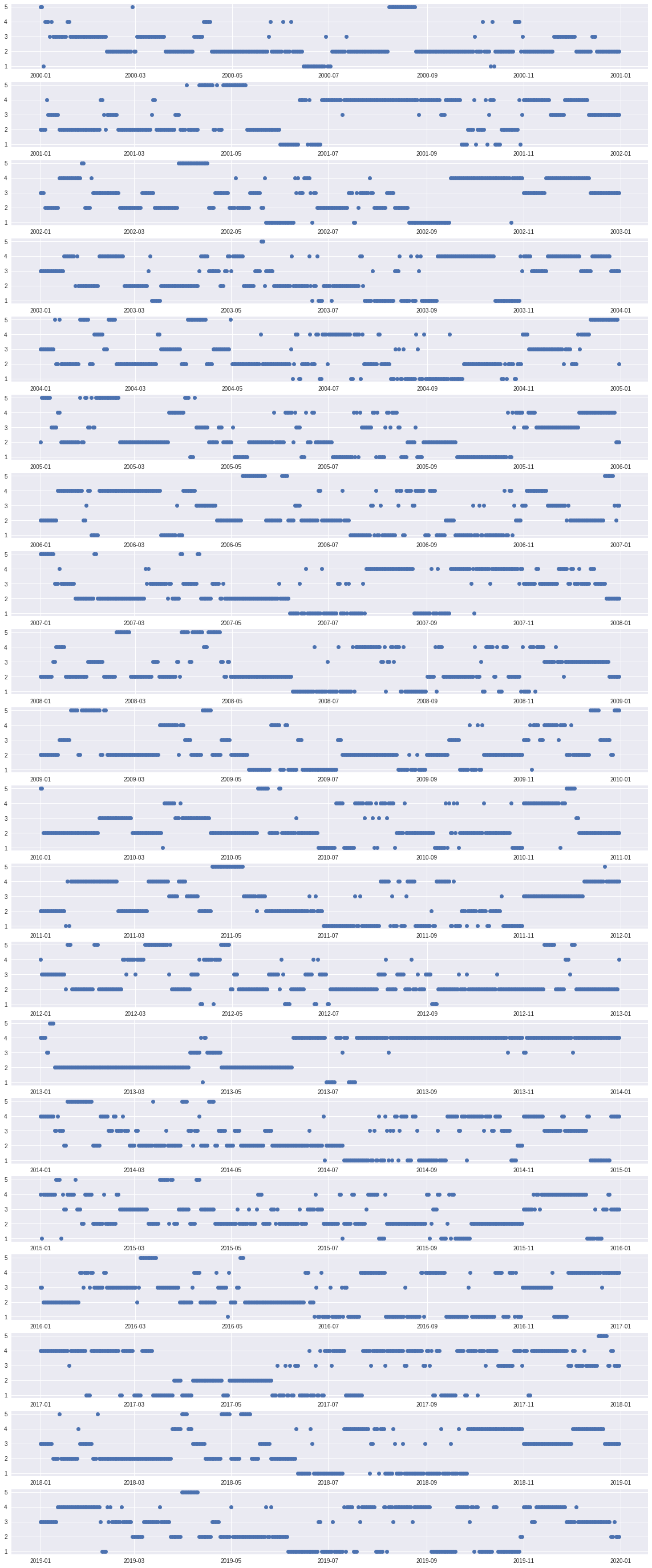
1.8.1.1. Conclusion
A more complex analysis of the results is needed. Nevertheless yet from the last kind of graph is possible to conclude that a meaningful clusterization has not been reached. This is more clear if the whole 20 year period is taken into consideration. Indeed if only one year is analyzed the last figure is of the kind expected. where we can observe some stable continuous periods with the possibility of interruption due to extreme events. Never the less if more than one year is taken into consideration that is not possible to observe good stability on the type of cluster in similar seasons together with strong variability on which cluster is showing a stable/event type behavior (Seasonal/extreme events). An indication that the model has not been able of well classify different discharge regimes is also the uniformity of the SOM distance matrix. Possible improvements can be done by changing the first clusterization method (used to reduce dimensionality) possibly with one that does not require a pre-definition of the number of clusters. Also, a possible issue is with input dataset to the SOM and as it is may still carrying stronger geographical information (relation of importance between catchments) then temporal and as a such a better pretreatment of data may also be a possible way to make emerge different discharge regimes.
[ ]:
[ ]:
[ ]:
[ ]:
[ ]: